
An accessible race begins with entry
The start venue may be easy to reach and the on-site team attentive, yet a participant can get stuck at the entry form. An unlabelled field, an unreadable error or a selector usable only with a mouse can prevent someone from registering independently. The digital interface is therefore as much part of an event’s accessibility as the race village.
This article offers runners and organisers considerations for examining usability. It draws on the W3C WAI forms guidance, but is not a full compliance audit or legal advice. One checklist or automated score cannot establish the accessibility of an entire entry process. The actual task, associated payment and confirmation need to be tested together.
Start by mapping the complete entry journey
The process involves more than entering a name and email address. It may include choosing an event, signing in, selecting a distance, providing additional details, reviewing, paying and receiving confirmation. List which steps use your own interface and which belong to an external provider. When users move between them, make their position and next step clear.
Do not stop testing at the form’s first screen. A participant can also encounter a barrier at the payment provider or an emailed confirmation link. The organiser’s responsibility and ability to fix problems may vary, but the entrant experiences one process. Identify these connections in issue reports just as precisely as your own fields.
Give every field a clear, persistent name
The W3C WAI guidance on labelling controls emphasises properly associating a control with its label. The label should explain which information is requested. Placeholder text inside a field that disappears while typing is insufficient on its own: users may later be unable to recall what they were answering.
Distinguishing similar details is particularly important for race entries. The entrant’s name, billing contact’s name and relay member’s name may refer to different roles. Repeated labels saying only ‘Name’ provide little information. State the role and arrange related fields into clear groups. In addition to visual proximity, assistive technology needs to understand their relationship.
Explain required information and formats in advance
The expected date format or information should not become apparent only after a failed submission. Put necessary instructions near the field in plain language. Make optional information clear too. Entrants should not have to guess whether leaving a field empty will make the next-step button disappear.
Examples should match the formats the system actually accepts. If several phone-number formats can be handled, do not require an unnecessarily narrow one. Test names with accents and different name structures in practice too. A comfortably usable form does not expect participants to discover the backend’s technical limitations for themselves.
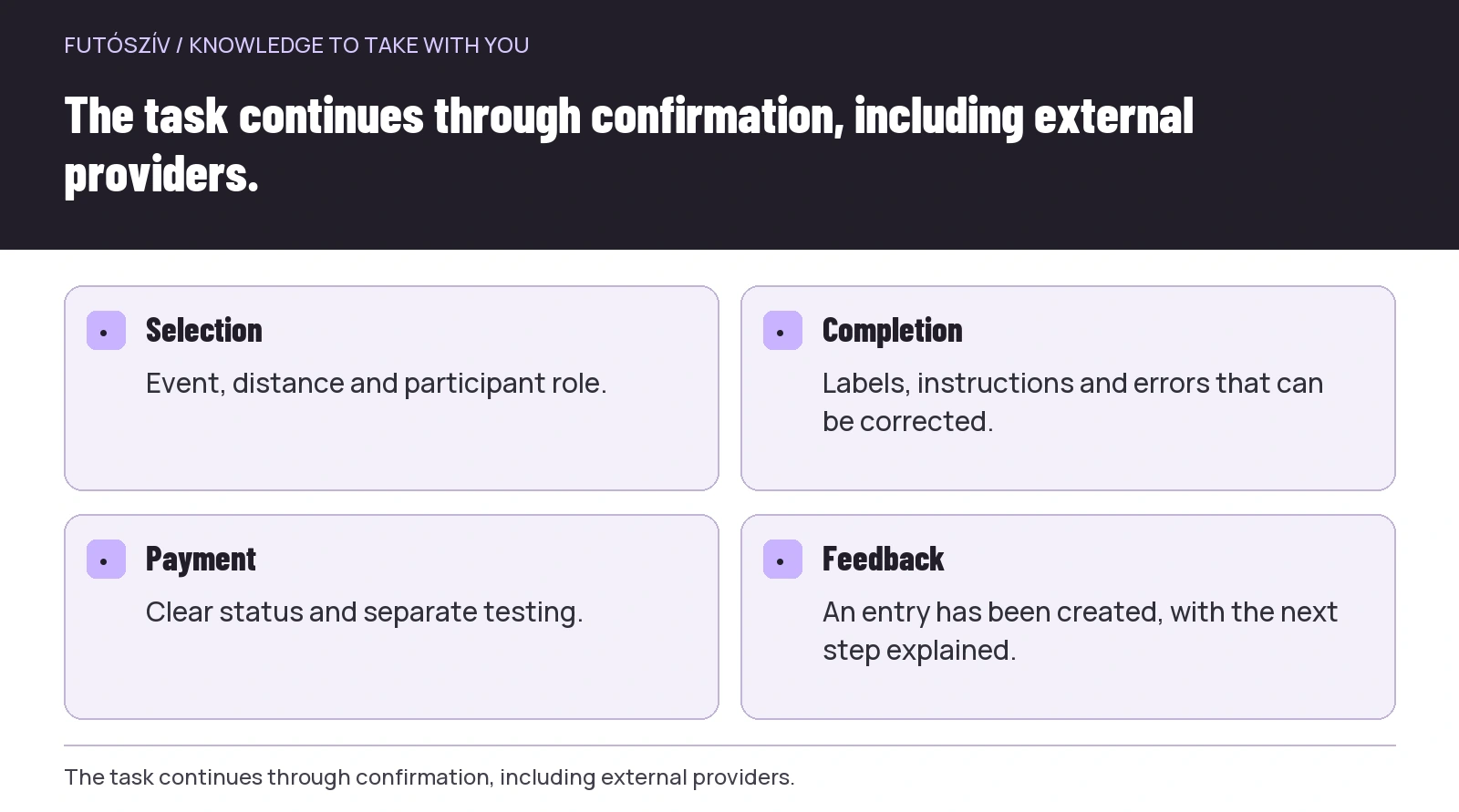 Enlarge diagram
Text version of the illustration
- Selection
- Event, distance and participant role.
- Completion
- Labels, instructions and errors that can be corrected.
- Payment
- Clear status and separate testing.
- Feedback
- An entry has been created, with the next step explained.
Test every choice using a keyboard
Set the mouse aside and work through entry using a keyboard in a test environment. Can you always see which field or button has focus? Can you reach every distance, checkbox and additional choice? Can you open and close the pop-up? The aim is to identify specific barriers, rather than accidentally submit a real entry.
Keyboard testing alone is not a complete accessibility check, but can reveal many basic problems. Record the step and expected behaviour rather than simply saying it is wrong. For example, the distance selector opens but you cannot move to the next option; or focus is no longer visible after closing a pop-up. Such descriptions give a developer an actionable task.
Make targets easy to hit
The explanatory material for W3C WCAG 2.2 specifically discusses the size and spacing of targets activated with a pointing device. Minimum requirement 2.5.8 describes a target of 24 × 24 CSS pixels or sufficient spacing under defined conditions, with several exceptions. This is a minimum rule, not a promise that every such button will feel comfortable.
Give important entry buttons and selections even more comfortable space where possible. Do not place the next-step control tightly beside a delete-all action, and make the longer label clickable alongside a small checkbox. Limited hand movement, tremor and a small touchscreen can create different difficulties; larger, separated controls help in several situations.
An error message should explain how to proceed
The WAI guidance on notifications recommends short, understandable error and success messages. An error should identify the affected field and the correction needed. A red border alone is not enough explanation. Users should not need to reread the whole page to discover why they cannot continue.
For a race-entry example, instead of ‘Invalid data’, the system can explain that the birth-date field needs a complete date and show an accepted format. If there are several problems, a clear summary can help users reach the relevant fields. Correctly entered information should not disappear during correction. Test whether feedback can also be perceived through assistive technology.
Make progress understandable in a long form
If entry has several steps, participants should know how much remains and what comes next. Going back should not unexpectedly erase earlier answers. If there is a time limit, explain in advance how it works and what happens when it expires. The general WAI forms guidance also discusses understanding time limits and, where possible, supporting users’ own pace.
A race’s actual entry deadline and a short browser-session limit are different questions. An event may fill up, but this does not automatically justify rushing every field. Establish organisational and security constraints with the provider, and plan how to handle lost data or uncertain states too.
Zoom and mobile layouts are part of real use
Important information and the ability to proceed should remain available with enlarged text or a narrow screen. Labels should not overlap fields, errors should not disappear behind a fixed header, and a cookie-settings panel should not cover an important button. Use real content in testing, rather than only short sample details.
Pay particular attention to long event names, multi-part personal names and repeated relay-member fields. A short label in a design mock-up may fit while the actual race-distance name gets cut off. Alongside technical testing, concise text and a clear task sequence can improve usability. Accessibility is not merely an extra added at the end of interface design.
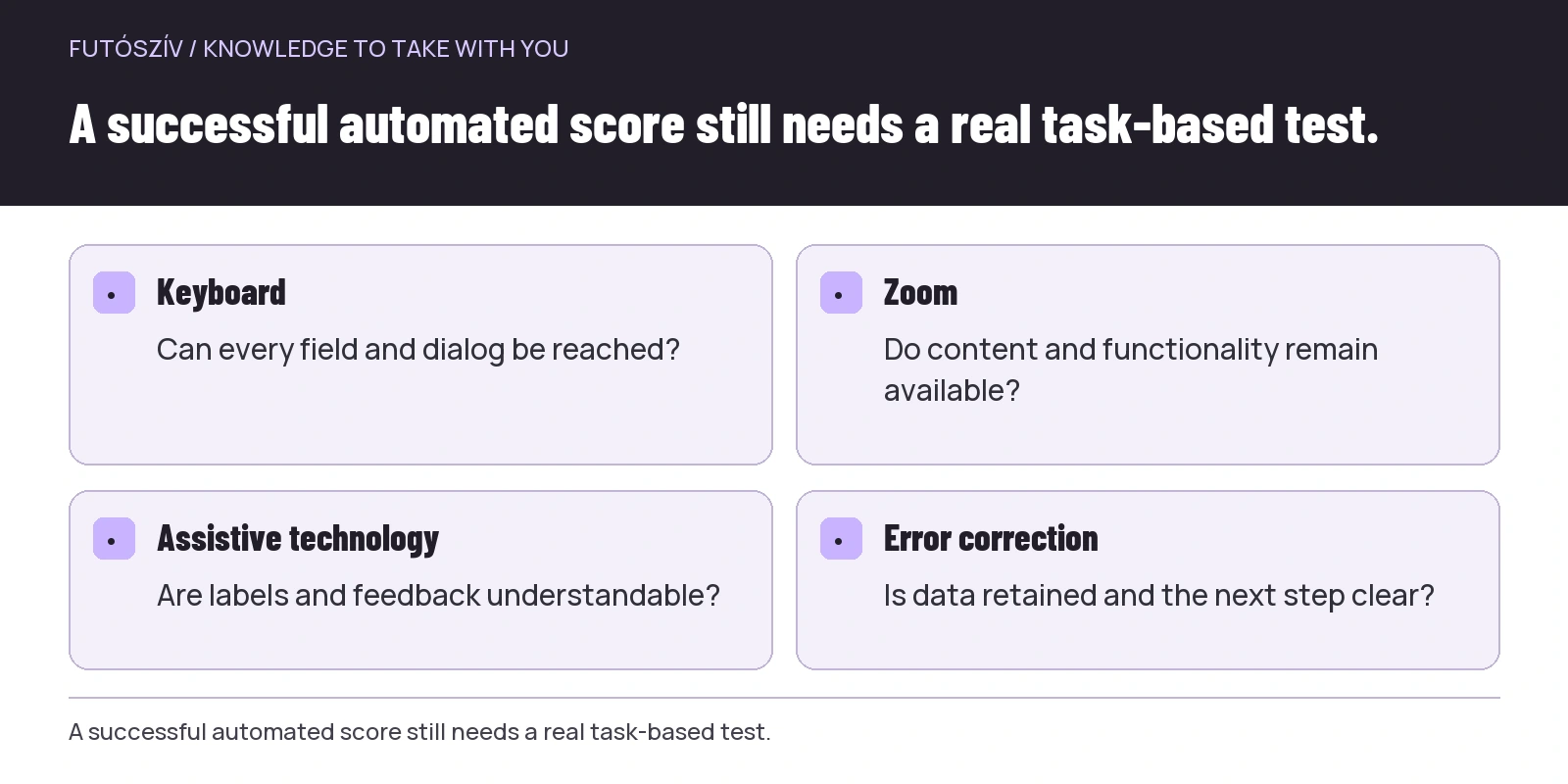 Enlarge diagram
Text version of the illustration
- Keyboard
- Can every field and dialog be reached?
- Zoom
- Do content and functionality remain available?
- Assistive technology
- Are labels and feedback understandable?
- Error correction
- Is data retained and the next step clear?
Only request information with a clear purpose
If participants need assistance or an adjustment, they should not automatically have to enter a detailed medical history into a public field. Entry details and the channel for discussing individual needs can be separate. As organiser, make clear who reads the message, which questions you can answer and how further discussion will happen.
Legal compliance for data handling needs appropriate expertise; this article does not establish a legal basis for processing. From a usability perspective, however, a simple principle is that people should understand why information is requested. An unnecessarily lengthy or intrusive form can create more barriers. WAI also supports simpler forms limited to information necessary for the process.
Make submission and payment status unambiguous
A ‘Thank you’ message does not always explain whether an entry exists, payment is still outstanding or only an enquiry has been received. The confirmation should name the event, chosen distance and next necessary step. On returning from an external payment service, users should not be left unsure whether they need to restart the process.
Use a separate testing option supported by the provider. Do not use real card charges to discover whether an accessibility fix works. Successful and failed payments should both have understandable feedback that can be referred to later. Design the exact financial behaviour according to the entry and payment providers’ rules.
Make the way to request help independently usable too
A participant who gets stuck should know where to report it. Contact should not depend solely on a second form that is difficult to use. Explain which details help troubleshooting: the step, device and expected result. Do not request passwords, full card details or other unnecessary sensitive information.
Do not close an issue simply by telling someone else to fill the form in for the participant. Temporary assistance may be necessary, but the barrier to independent use still needs fixing. Record the cause and next step. If an external provider is involved, the precise description can also be passed on within an appropriate personal-data framework.
Test the full task with real users
An automated checker can reveal some errors, but cannot assess every use situation. Invite participants using different devices and assistive technologies to an agreed test. Make clear that you are evaluating the interface, not their abilities. Allow sufficient time and accessible communication for feedback.
After testing, categorise the specific barriers: missing information, unusable controls, lost data and uncertain steps. Check fixes by repeating the same task. Accessible entry requires ongoing maintenance: a new distance selector, payment provider or visual redesign can affect the whole journey again.
Sources and further reading
- W3C WAI: Forms Tutorial
- W3C WAI: Labeling Controls
- W3C WAI: User Notifications
- W3C WCAG 2.2: Target Size Minimum, understanding document
How Futószív articles are prepared: our editorial guidelines.