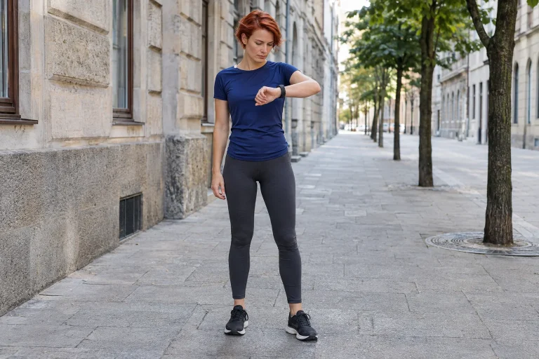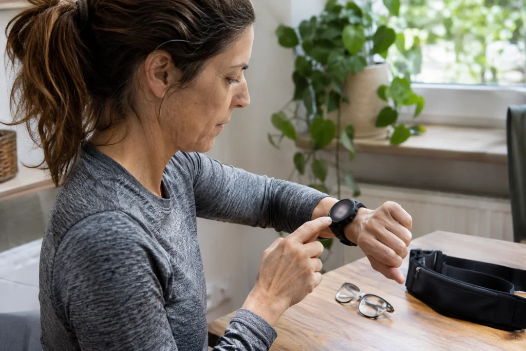
A running watch can display time, distance, heart rate, pace, elevation, lap count and a few small graphs. Being able to show everything does not make every number useful at once. While running, you glance briefly at your wrist, read in motion and look back to the route. The first screen should therefore provide understandable information for the next real decision. This article builds simple displays for different aims, distinguishes similarly named fields and presents a readability trial you can do at home. Examples are not compulsory training prescriptions or universal heart-rate targets.
Write a one-sentence task for each screen
Begin: “From this page, I want to know…” On an easy run, the answer may be how long you have been out and whether it is time to turn back. In a session of defined sections, you want progress through the current part. On unfamiliar terrain, interpreting the next junction may matter more than overall average pace. Expecting one page to do all three quickly crowds it. Defining the task helps select the primary number and decide what can wait for a second page or post-run analysis.
Do not treat a packed factory screen as an expectation. Most configurable fields are possibilities, not compulsory learning material. The Apple guide to workout views also describes selection and ordering options, with details depending on device and workout type. Find modification instructions in your own manual. If a page cannot be edited on your model, work with what is available; useful information order is possible on a simpler watch too.
Understand the field name first
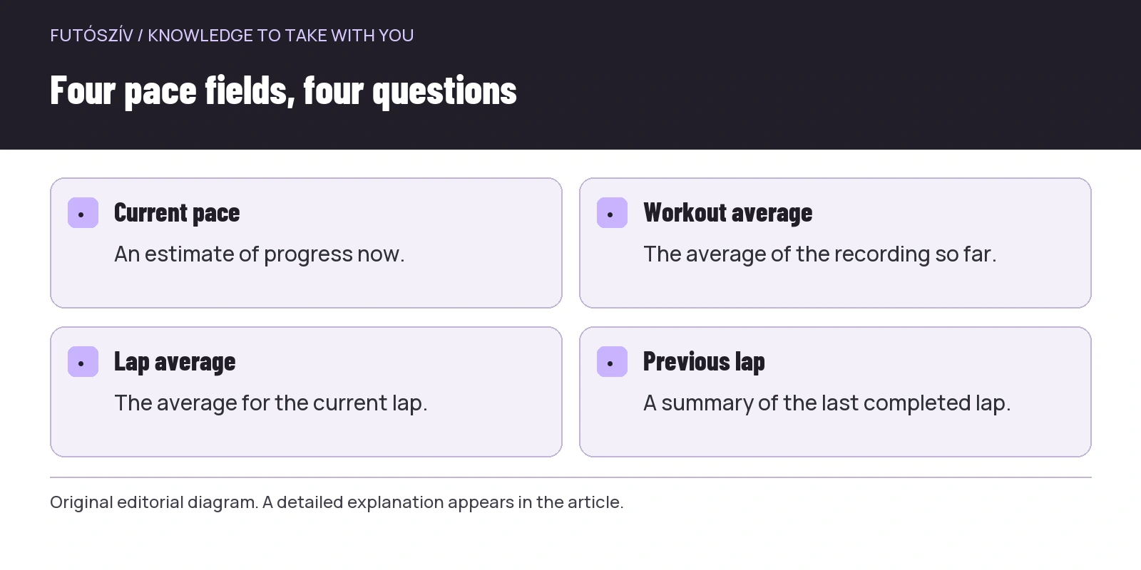
Current pace, overall workout average, current-lap average and previous-lap pace answer different questions. The Garmin Forerunner 165 data-field guide lists these separately too. An abbreviated Hungarian label may be difficult to read, so find the full meaning in the manual. Do not identify it by a familiar number: several different fields can show similar values early in an even run, then behave very differently later.
Time fields can differ too. Activity timer, total elapsed time including stops, lap time and time of day are different data. With automatic pause, knowing which counter stops matters particularly. In a theoretical example, ten minutes running, three stopped and another ten running make total continuous elapsed time twenty-three minutes, while the paused activity timer may show twenty. This is arithmetic illustration, not a measurement from a particular watch. Check your own fields in a short trial.
 Enlarge diagram
Text version of the diagram
- Current pace
- An estimate of progress now.
- Workout average
- The average of the recording so far.
- Lap average
- The average for the current lap.
- Previous lap
- A summary of the last completed lap.
The direction of numbers matters too
With minutes-per-kilometre pace, a smaller number means faster progress. Six minutes per kilometre is ten kilometres per hour; five minutes per kilometre is twelve kilometres per hour. These are simple conversions: divide sixty minutes by the minutes needed per kilometre. Accidentally selecting speed and comparing it to familiar pace can mislead. Use a first-screen unit you understand quickly without mental conversion while running. Information from a brief glance should be immediately interpretable.
As a session progresses, overall average pace becomes less sensitive to one short section. If the first five kilometres of a theoretical run take thirty minutes and the sixth five minutes, overall average is thirty-five divided by six, approximately five minutes fifty seconds per kilometre. The sixth kilometre was still five minutes. Whole-workout average therefore does not directly show current-section pace. Choose what belongs to the task when designing the screen, rather than the more familiar name.
Easy running: a few fields can be enough
If the aim is time-defined easy movement, activity time can be a useful primary field. Add distance and an intensity-related measure you understand and use for a justified purpose in your own training. Heart-rate display need not be prescribed to everyone, and a displayed pulse does not override how you feel or previously clarified health boundaries. The screen aims for clarity: know progress without changing pace for every refreshed value. Reading is a tool, not a separate training task.
Current pace can create restlessness on an easy run even without a precise pace target. If you constantly correct the number, try leaving it off the first page. The data may still record and remain available later if device and profile work that way. The aim is deliberate allocation of attention rather than hiding information. On a timed run, remaining time may help more than following current pace second by second. Choose for the actual task.
Intervals: make the current task visible
In structured training, distinguish the whole recording from the current work or recovery section. Remaining time or distance, section number and pace for that part serve different purposes from overall average. If the watch handles workout steps separately, check which field relates to them. A manually marked lap is not identical to a structured step in every system. Learn the lap button’s effect calmly, rather than guessing what restarted during the second repetition.
In an illustrative situation, not a training plan, a shorter work section follows warm-up. Overall average pace still includes warm-up and does not directly reveal execution of the current part. That section’s duration and remaining quantity help follow the already planned task. Design the screen so an important signal does not hide in a tiny, constantly alternating field. Choosing the training aim and designing the display are separate questions; this article addresses the latter.
| Running situation | The first page’s question | A possible primary field | What can move to page two |
|---|---|---|---|
| Time-based easy running | How long have I been out? | Activity time or time remaining | Overall average and detailed graph |
| Structured section | Where am I in the current part? | Remaining section time or distance | Whole-workout time and total distance |
| Running tracked with manual laps | What happened in this lap? | Lap time or lap average | Previous-lap details |
| Unfamiliar route | Which way should I go? | An appropriate navigation view | Workout statistics |
| A long run with a time limit | How much total time has elapsed? | A total-time field appropriate to the aim | Activity time for separate comparison |
On trails, navigation may deserve a separate page
On an unfamiliar route, a map or trace should not decorate an overcrowded statistics page. Navigation needs readable size, appropriate zoom and knowledge of device capabilities. Current pace on steep, technical ground has another context from flat tarmac; do not expect a brief glance to evaluate the whole session. Practise switching between navigation and training data beforehand. Stopping safely before a junction to orient yourself is better than deciphering a small map in motion.
Distance remaining on the route and distance to the next point can easily be confused. If a loop crosses itself several times, route state matters too. Ask not merely whether an arrow appears, but what it means in that situation. Learn navigation separately on familiar terrain. A watch screen does not replace advance route review, local conditions and an appropriate backup navigation plan. Its first-page task here is supporting navigation, not taking it over entirely.
 Enlarge diagram
Text version of the diagram
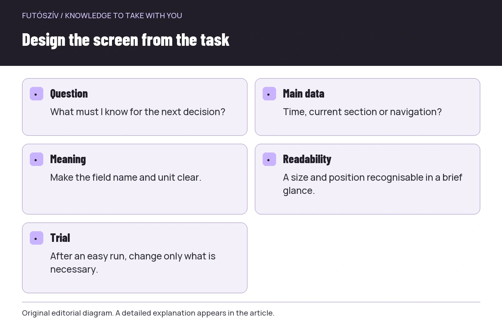
- Question
- What must I know for the next decision?
- Main data
- Time, current section or navigation?
- Meaning
- Make the field name and unit clear.
- Readability
- A size and position recognisable in a brief glance.
- Trial
- After an easy run, change only what is necessary.
Readability: field count is not a neutral choice
Four clear fields may be more useful than six tiny numbers, but the appropriate count depends on display and vision. Wear the watch in your running position, select the page and inspect with a brief glance. If you must decipher the label first or confuse two time fields, simplify. Position matters too: put the most important field where it is easy to find and keep similar pages consistently structured where possible. This reduces remapping the display at every glance.
Do not rely solely on colours for meaning. A zone colour helps only when you understand the range and can distinguish it in that light. Sun, cloud, darkness and glasses create different situations. Inspect available brightness, background and number-size settings separately. Automatically rotating pages can be convenient but may hide the desired data at the moment you look. If distracting, alter page switching within your model’s possibilities.
A two-page system with clear roles
One possible design reserves page one for immediate decisions and page two for the broader picture. The first has few fields checked briefly while running. The second holds total distance, total time or another less frequently needed summary. This is a practical design pattern, not a manufacturer standard. The Polar workout-view editing guide also presents available layouts by device. Check actual field count and editing possibilities on your watch.
If you do several kinds of runs, you may not want the same profile and page order for each. A separate profile helps only when easily recognised at departure and its automations are understood. Do not multiply a dozen almost identical versions. Two clearly purposed views may be simpler than six profiles with similar abbreviations. After editing on the watch, check the mobile app retains the intended state and necessary sync has finished. Configuration is complete only when departure actually shows what you planned.
Edit again after an easy trial
On the first trial, evaluate which data you actually sought, rather than how impressive the page looks. How often did you change pages? Which number did you never view? Was a field misread or interpreted differently? Make changes afterwards based on these, preferably one at a time. If total time was missing, do not immediately add five fields. Make room for that one, then check readability. Adapt to your own use rather than copying another runner’s screenshot.
The final filter is simple: for each first-page field, name a decision it supports and a sentence explaining exactly what it measures or calculates. If either is missing, read more or leave it for later. Post-run analysis has its place; every recorded measure need not be visible live. A well-designed first screen works quietly: glance, obtain necessary information and return attention to movement and surroundings. This usability, rather than the number of fields ticked, measures success.
Sources and further reading
- Apple – Customize Workout Views
- Garmin Forerunner 165 – Data Fields
- Polar – editing sport profiles and workout views
How Futószív articles are prepared: our editorial guidelines.