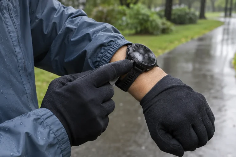
Your companion’s phone shows a rain icon beside the planned run, while yours shows cloud. You searched for the same city and are preparing for the same afternoon, yet the displays differ. The first task is not to choose the more pleasant picture. First check whether you are really comparing data for the same location, period and quantity. Two apps may look similar while displaying different products underneath.
This guide offers an original comparison process you can follow. It does not identify the best weather app everywhere or derive a provider accuracy ranking from a single run. The aim is to distinguish an apparent difference caused by settings, a different product and the forecast uncertainty that remains. We use provider descriptions and clearly identified numerical examples, then connect the checks to your own running plans.
Alongside the town name, check the location actually selected
First open the detailed location view on both interfaces. Are you using your current location, a saved town or a point selected on a map? The planned running location is not necessarily where the phone is now. If one of you is looking at a home favourite and the other at a point near the park, matching city names alone does not complete the comparison. Do not seek an explanation for two different numbers before selecting the precise place.
The Met Office description of local forecasts explains that data extracted from models may undergo location-specific processing. This is an important example because a display assigned to a city is not necessarily a direct measurement from that street corner. The service connects data to the location using its own method. We are not claiming that every app selects grid points or applies corrections identically; the description of that method is precisely what is worth seeking from the provider concerned.
For your own comparison note, the place name, selection method and available coordinates or map point may be enough. You do not have to publish a sensitive home address to keep your own investigation traceable. If your running loop crosses several environments, the situation still extends beyond its starting point. General town-level information may not distinguish conditions on a waterside section, an open area or higher ground.
Compare the same time window, not just matching clock digits
A daily summary, hourly row and three-hour map step may address different time-related questions. The Met Office table explanation, for example, distinguishes temperature at the stated instant from certain data for the following period. This is its own product description, not a rule shared by every app. When comparing displays, read the field’s meaning alongside the time: does it represent an instant, a window beginning then or an accumulation?
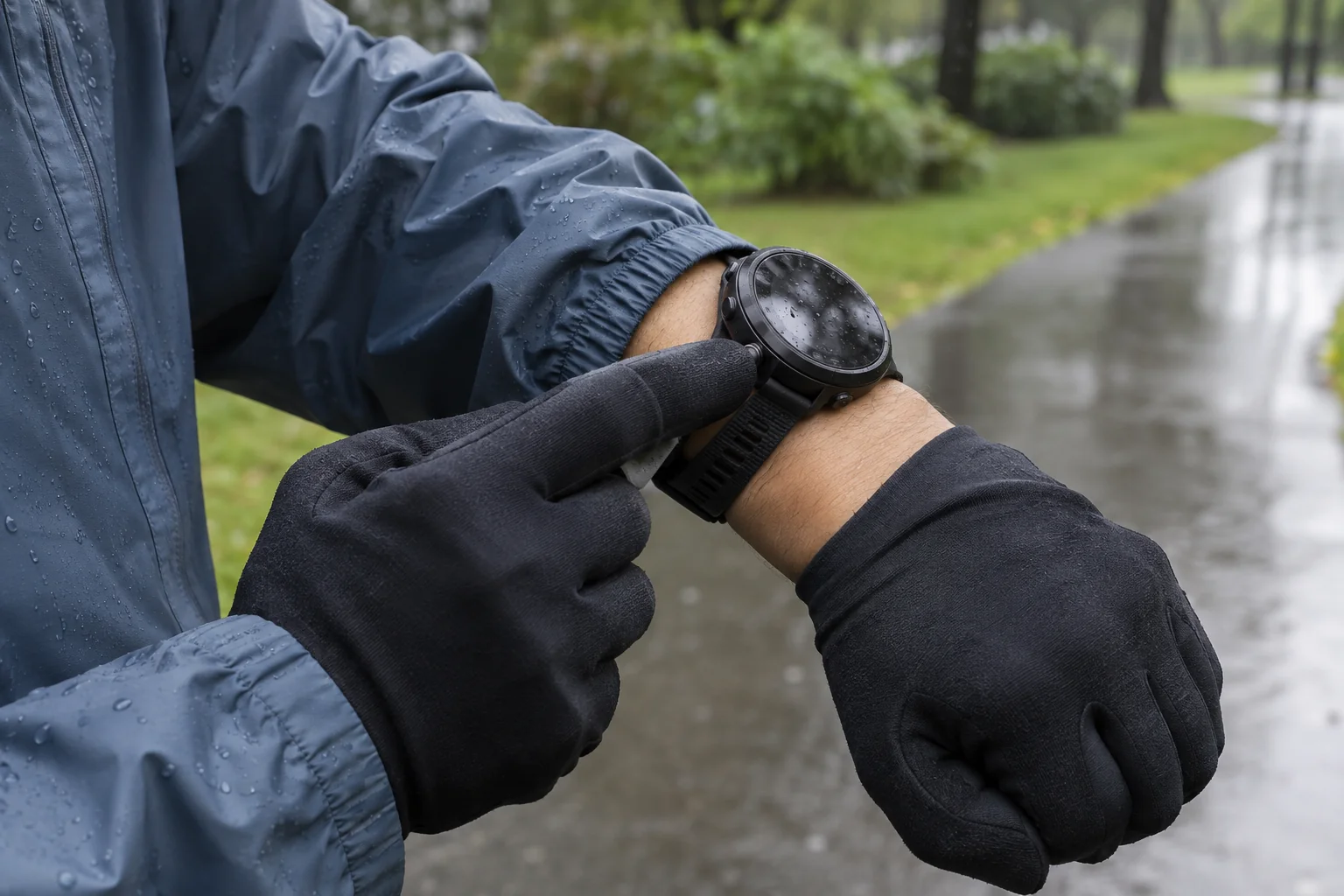
If you plan to start running at 17:00, first check whether both pieces of data describe a period relevant to your programme. The starting hour and your entire time outside are different questions. A day-long rain icon may coexist with shorter periods of different conditions, while a favourable-looking row at departure does not automatically describe the later journey home. The screen’s summary is not obliged to display your one-hour outing as a separate event.
Check the time zone separately when travelling. Your phone’s local time, the selected location’s time and the UTC timestamp on a technical map are not the same display system. You need not convert every time if an interface clearly states local time. What matters is not assuming this on an unfamiliar chart. Comparing times in different zones because their digits match would be an identification error, rather than a disagreement about the weather.
 Enlarge image
Units and data names resolve many apparent disagreements
The following table contains original, simple calculation examples. Columns A and B do not represent real apps, and the numbers do not come from a current forecast. They show how identical or different quantities can initially look different or identical. Use the table only to practise reading units and field names; no personal weather or equipment decision is assigned to its values.
| Display A | Display B | Interpretation |
|---|---|---|
| Wind: 5 m/s | Wind: 18 km/h | The same speed if the wind-data type and period also match |
| Temperature: 10 °C | Temperature: 50 °F | The same temperature in different units |
| Mean wind: 18 km/h | Gust: 30 km/h | Different data fields; not a direct contradiction |
| Precipitation accumulation: 3 mm over three hours | Intensity: 3 mm/h | Different quantities; not equivalent without the time history |
In the first row, the conversion is 5 × 3.6 = 18. In the second, the Celsius value is obtained from Fahrenheit as (50 − 32) × 5/9 = 10. Conversion resolves only the unit difference, however. If a number belongs to a different period or point, expressing both in common units does not make the situations identical. For the same reason, do not automatically confuse feels-like temperature with air temperature at a quick glance.
A useful personal sequence is: field name, unit, period, location, and only then the number. A screenshot may omit several of the first four details. If your companion sends only a cropped value, ask for the missing context before arguing with your own screen. Simpler data handling may provide more information here than immediately opening a third app. First you need the correct subject of comparison, rather than more numbers.
An app’s name does not always describe all its data sources
Apple’s support page published in June 2026, for example, lists sources and regional availability separately for ten-day forecasts, severe-weather information and next-hour precipitation data. Hungary is absent from the next-hour precipitation country list in the checked version. This does not mean all Apple weather features are unavailable; it shows that different parts of an app may receive different data and availability. Do not automatically infer domestic usability from a feature you saw abroad.
Within the app, therefore, look for a source for the specific field, rather than only a general company logo. Current conditions, multi-day forecasts and warnings may be separate information products. If one part is unavailable in your region, do not interpret its absence as ‘no event expected’. Check the provider’s documentation for what is available, then use another identifiable, appropriate source for the missing task.
The weather24 help page names different models, data sources, calculation methods and update times as possible reasons apps differ. This is the provider’s own explanation, not an independent accuracy ranking. For runners, its value is showing that several processing differences may sit behind different displays. To identify a definite cause, those details would need to be established for the two particular apps, rather than assumed from their brands in general.
The update time is not necessarily the model-run time
In your own comparison, distinguish three times where available: when the underlying forecast run was produced, when the provider’s data was updated and when you loaded the screen. Not every interface reports all three. Leave missing information unknown rather than replacing it with the phone’s clock. An app opened now may use a forecast produced earlier; ‘I just checked it’ is not the same claim as ‘it was just produced’.
The Met Office public accuracy information also discusses automated app and web forecasts drawn from several models. New data and processing may therefore bring changes beyond a rearranged display. Compare an old screenshot with a new image only when both concern the same validity time, and identify when they were produced too. Otherwise, a forecast updated in the meantime can easily look like an unchanged contradiction published simultaneously.
If the connection is unreliable or it is unclear whether new data actually loaded, note that in your own record. An app-loading question does not immediately justify calling the forecast model wrong. The provider’s status information and help pages may assist with the technical issue. When planning your run, do not rely confidently on a detail whose currency you cannot establish. Clarify it before leaving for a calmer preparation, rather than scrolling your phone on the move.
An icon and a weather warning may serve different purposes
HungaroMet’s warning system provides written and map-based information on critical weather situations. Its operational description connects meteorologists’ assessments with observations and forecasts. This is a different product from an app’s summary weather icon. A favourable picture on the phone’s home screen does not imply the absence of an official warning. Check the appropriate area and period separately in the warning system; the accompanying written information matters too.
For your own outing, the probability of rain, wind, visibility and route condition are different questions. Do not expect a single icon to settle them all. If two apps differ, first identify which detail actually affects your plan. A route closure or organiser’s announcement is not overridden by a sunny symbol on the other phone. Gathering relevant information is not the same as selecting the most favourable screen.
An absent notification in an app is not the same as the complete absence of official information either. Regional support, the app’s own feature and the device’s notification settings may be separate technical details. Check them using your provider’s guidance. Before an important running outing, opening identifiable official information directly helps avoid treating the silence of an unfamiliar notification setup as a definitive weather judgement.
 Enlarge image
Make a short comparison and identify what remains uncertain
Put five fields on your comparison sheet: location, validity period, quantity and unit, data source or product, and available update information. Fill in the same five rows for both apps. Mark anything unknown. This separates what you have already aligned from what remains in question. An incomplete source description does not require an invented model name in the table, nor does a screen showing more data deserve a declaration of certain success.
If the forecasts still differ after these checks, the difference may represent uncertainty relevant to your decision. Opening four more apps and averaging their numbers does not necessarily resolve it. The sources may not be independent, and the data may not concern the same event. Your task is instead to retain an appropriate alternative alongside the unanswered question: another time, a straightforward local outing or postponement if needed.
Different displays on two phones can therefore be a starting point for more precise information-seeking. First identify what is genuinely being compared, remove differences in units and time windows, then assess the actual forecast difference within your whole outing. The method does not promise perfect running weather. It helps you understand the data behind your decision and avoid filling a missing detail with a more convenient icon or a provider’s general reputation.
Sources and the limits of the original comparison
Met Office: Local weather forecast – location-specific data processing. Met Office: explanation of tables and time periods; Met Office: public forecast accuracy and automated products. Apple: Feature availability and data sources in the Weather app, 2026 – data sources by feature and regional support. weather24: different and changing forecasts, the provider’s own help page. HungaroMet: how the warning system works. The A/B numbers in the table are original calculation examples, and the five-field check is an editorial method; this article does not report an original comparative test of app accuracy.
How Futószív articles are prepared: our editorial guidelines.